7 Conventional Landing Page Design Tactics You Should Still Test

Conventional wisdom is usually the safe play. Why take risks when there’s an established “right way” to do things?
In marketing, however, success often falls to those willing to buck trends and experiment.
When it comes to optimizing your landing pages, complacency and assumption are your worst enemies. It’s far too easy to defer to best practices instead of discovering what makes your unique audience click. Proven landing page techniques are commonly practiced for a reason, but what works for 90% of websites won’t automatically work for yours.
The genius of A/B testing your landing pages is that it allows you get a little bit crazy without making a permanent error. You can be as unconventional as you want, and testers consistently find that extreme adjustments are required for extreme wins. If you’re using a template anding page designer, making these “big changes” can take less than a minute, so there’s no excuse to play it safe.
To get the big wins, you need to test even when the answers seems obvious. Here are seven landing page “best practices” you should be challenging on your site.
7 Landing Page Design "Best Practices" You Should Still Test For Yourself
1) Minimalistic Design
Conventional wisdom dictates that landing pages should remain as empty, calm and spacious as possible. No distractions. Three colors maximum. One font. Like this landing page from DropBox for Business:
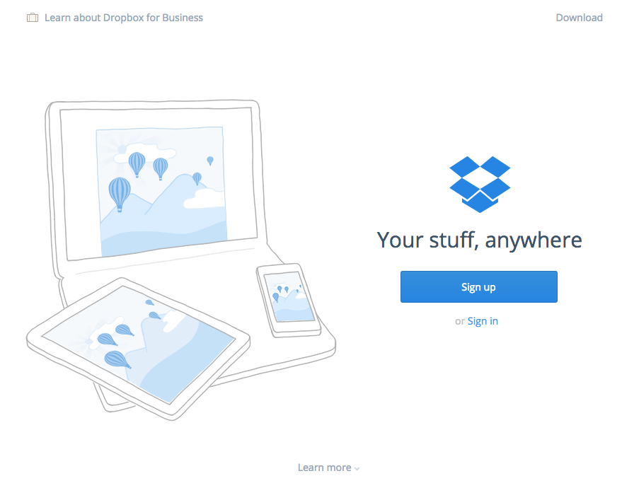
The issue with this hard-and-fast "rule"? Different audiences demand different stimuli at different times. A Swiss audience might react differently to sleek design than an audience based in the rural America. Millennials are used to considerably more stimulation than an AARP crowd.
While simplicity is a “best practice” for a reason, like any practice, it should be tested specifically against your audience. Sometimes a more complex layout can drive more conversions.
2) Smiling Faces
A variety of studies (including several here on HubSpot) have demonstrated the effect a smiling face can have on your conversion rate. Human faces can create emotions within your visitors and help compel them to take action.
But images of human faces can also distract visitors. The human-free version of the HubSpot landing page below actually converted 24% better than the one with a smiling face that you're seeing.
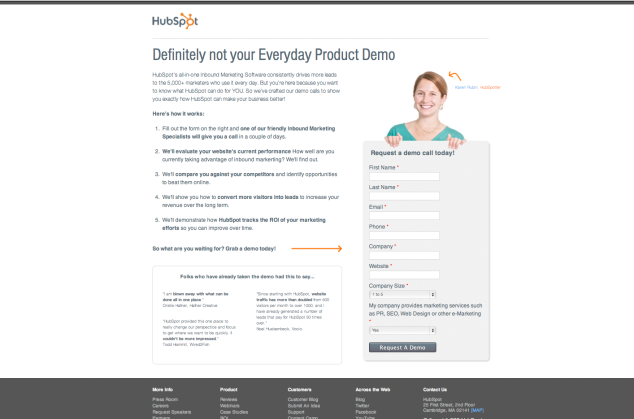
One of the biggest problems I see is with smiley photos is incorrect implementation. Many businesses will use images that are pretty obviously stock photos -- you know, the ones with painfully fake smiles -- in order to capitalize on this “best practice.”
But, in some cases, stock photos can actually kill your conversion rate, so you'll want to tread carefully here. High quality photos of real people are the best way to go, but again, they won’t work for every one of your landing pages. (Here's a list of 10 sites for free, non-cheesy stock photos to get you started.)
3) Security Seal
An eTrust, PCI or BBB badge on your page supposedly assuages fears that your site visitors may be harboring, so they can feel free to move forward with your offer, knowing their information is secure. In the example below from bills.com, you'll find several trust seals on the left-hand side.
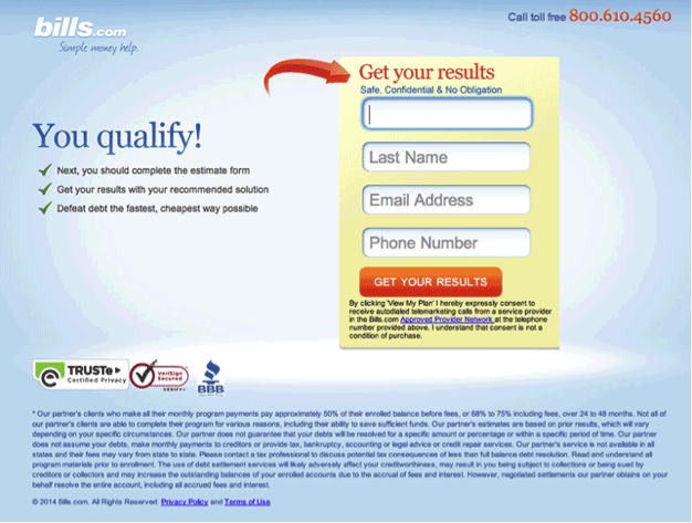
Consider, however, that people often associate these types of seals with web forms relating to financial transactions. If you’re not asking your visitor for money, and yet you place a trust seal next to your signup form, it might raise suspicion that credit card charges could soon appear.
In situations like these, your landing page may perform better without the icons. It’s not so much a case of poor principles, but more a misapplication of good principles. Building trust with your visitors is paramount, but you want to save trust verifiers for the right point in your conversion funnel.
For more on trust seals and whether your landing page needs one, read this blog post.
4) Offering Only Legitimate Service Packages
A lot of marketing is simply the extension and exploration of natural intuition. For the most part, this stuff makes sense. But there are times when the study of human response can throw us for a loop.
When creating a pricing page, it would make sense to add a variety of packages to most efficiently engage with demand. You want to offer several legitimate package options and optimize your price points for max revenue. That’s standard practice.
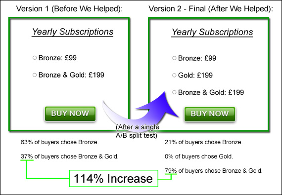
But what several marketers have found is that customers will actually convert at a higher rate with the inclusion of an irrational option no one would ever buy. The concept stems from our inclination to compare objects that are more similar. By including an obviously inferior option that's similar to our desired sale package, we can influence users to make the desired purchase.
For example, Carter & Kingsley increased a client’s profits by 114% simply by adding a package no rational person would ever buy:
Unbounce did the same thing, increasing revenue by 233% with the inclusion of a made-up product:
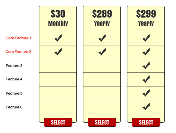
For some reason, this strategy can actually work -- and it might just be able to boost conversions on your website.
5) Adding Social Proof
Social proof can actually be extremely powerful at building trust with your audience and leveraging the power of the crowd for the purpose of conversions. But like so many other “best practices," social proof is only effective when applied within a specific set of parameters. The misapplication of social proof can significantly sabotage your conversion rate. Its power to destroy is directly proportional to its power to build.
For example, CalPont saw a big conversion boost after removing social share buttons from their page content.
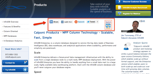
Taloon.com increased CTA click-throughs by 11.9% after eliminating social share buttons.
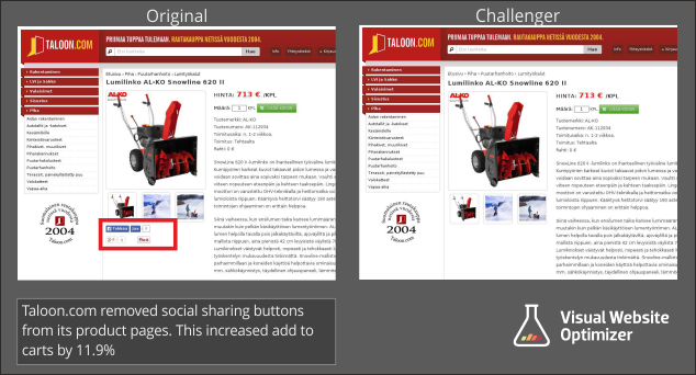
The unifying factor here is that negative social proof is just as powerful at discouraging conversions as positive social proof is at increasing them.
In both of these examples, the pages tested tended to have a low share rate. Not all content is the type people want to circulate on social media. Accordingly, the visual display of low share counts actually worked against the company. It essentially told the customer, “No one wants this, and you shouldn’t either.”
So while social proof can be a big win in certain scenarios, it's something worth testing, because it will likely work against you if you’re not careful.
6) Hiding The Price
Any salesperson will tell you to never reveal the price too early. The price is nothing more than a figure until you’ve been able to first establish the value of your product or service. Then, once you’ve built up the value in your readers’ minds, revealing the price makes it look much less intimidating -- and can even be utilized as a major selling point in your pitch.
In a person-to-person sales presentation, this means saving the price for the close or pre-close. On your website, this traditionally looks like waiting until the bottom of the page to include your price or saving it for after your customer clicks-through to continue the sales process.
But, as we are highlighting in this article, standard best practices don’t always work. And that’s what SafeSoft Solutions found when they included their price above-the-fold in the middle of their homepage hero shot.
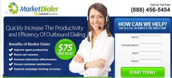
The only change they made to the landing page above was to add in the $75 price sticker, and it increased conversion by 100%. What if you, too, are just a simple change away from doubling your sales? It's worth testing out.
7) Using Video
In a sense, this principle is akin to “bacon makes everything better.” It may be true most of the time, but anyone who's attended a creative dinner party and been served bacon-wrapped sushi knows better. (Sushi is good, and bacon is good. But together, they make for culinary revulsion.)
While video can be an effective (and visually appealing) tool for enhancing impact or conveying a difficult concept, when it comes to landing page conversions, it can also alienate, over-stimulate, or distract your audience's attention from your primary call-to-action. Here's an example of video on a landing page from Shopify:
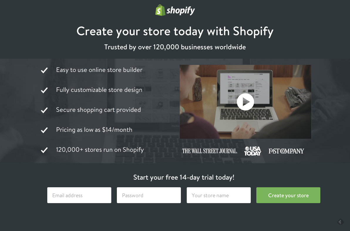
In one case, testers found that replacing their homepage video with a much-maligned image-slider actually increased signups by 30%. Another business increased conversions by hiding its intro video within a modal box instead of featuring it within an embedded player.
Test, Rinse, Repeat
The "best practices" of landing page design can help you to jump into marketing with a solid game plan. What works well for the majority of companies might do fine for yours. But once you've gained some context and experience, it’s time to take off the training wheels and start testing for you unique audience.
Every brand is different. Every landing page is different. Every website visitor is different. What fails for 90% of businesses might catapult yours into success. You’ll never know until you start challenging the cookie cutter practices and figuring out exactly what works for your audience.

1 Comments:
Effective landing page design is critical for the success of your business website. Here are some common landing page design that is very important for your landing page. landing page designer
Post a Comment
Subscribe to Post Comments [Atom]
<< Home