5 Simple Ways to Optimize Your Website for Lead Generation

Optimizing your website to generate leads is a no-brainer. But it's not as simple as throwing a "click here" button on your home page and watching the leads pour in. (Unfortunately.)
Instead, marketers and designs need to take a more strategic approach. In this post, we'll go over some quick ways you can optimize your website for lead generation that actually work.
To understand how to optimize our website, we'll have to first gain a basic understanding of the lead generation process. What components are at play when a casual website visitor turns into a lead? Here's a quick overview:
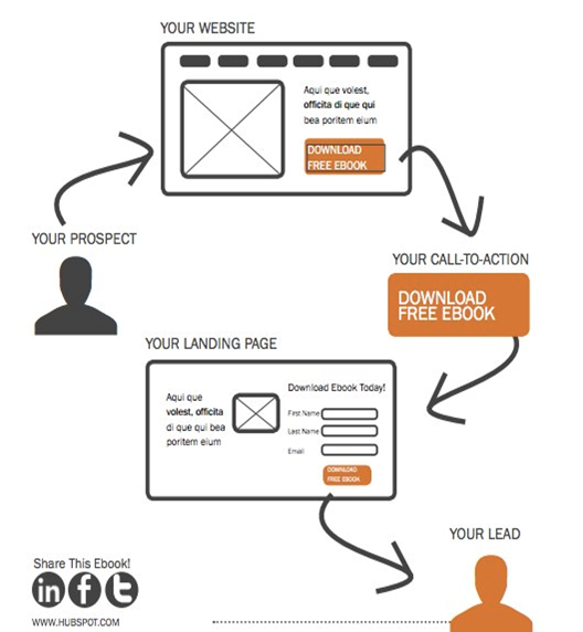
The lead generation process typically starts when a website visitor clicks on a call-to-action (CTA) located on one of your site pages or blog posts. That CTA leads them to a landing page, which includes a form used to collect the visitor's information. Once the visitor fills out and submits the form, they are then led to a thank-you page. (Learn about this process in more detail in this post.)
Now that we've gone over the basics of lead generation, we can get down to the dirty details. Here are five simple ways to optimize your site for lead generation.
1) Figure out your current state of lead gen.
It's important to benchmark your current state of lead generation before you begin so you can track your success and determine the areas where you most need improvement.
A great way to test out where you are is to try a tool like Marketing Grader, which evaluates your lead generation sources (like landing pages and CTAs), and then provides feedback on ways to improve your existing content.
You can also compare landing pages that are doing well with landing pages that aren't doing as well. For example, let's say that you get 1,000 visits to Landing Page A, and 10 of those people filled out the form and converted into leads. For Landing Page A, you would have a 1% conversion rate. Let's say you have another landing page, Landing Page B, that gets 50 visitors to convert into leads for every 1,000 visits. That would be a 5% conversion rate -- which is great! Your next steps could be to see how Landing Page A differs from Landing Page B, and optimize Landing Page A accordingly.
Finally, you could try running internal reports. Evaluate landing page visits, CTA clicks, and thank-you page shares to determine which offers are performing the best, and then create more like them.
2) Optimize each step of the lead gen process.
If your visitor searched "lawn care tips" and ended up on a blog post of yours called, "Ten Ways To Improve Your Lawn Care Regimen," then you'd better not link that blog post to an offer for a snow clearing consultation. Make sure your offers are related to the page they're on so you can capitalize on visitors' interest in a particular subject.
As soon as a visitor lands on your website, you can start learning about their conversion path. This path starts when a visitor visits your site, and ends (hopefully) with them filling out a form and becoming a lead. However, sometimes a visitor's path doesn't end with the desired goal. In those cases, you can optimize the conversion path.
How? Take a page out of Surety Bonds' book. They were struggling to convert visitors at the rate they wanted, so they decided to run an A/B split test (two versions of a landing page) with Unbounce to determine which tactics were performing better on each page. In the end, they ended up changing a link to a button, adding a form to their homepage, and asking different questions on their forms. The result? A 27% increase in lead generation.
If you want to run an A/B test on a landing page, be sure to test the three key pieces of the lead gen process:
a) The Calls-to-Action
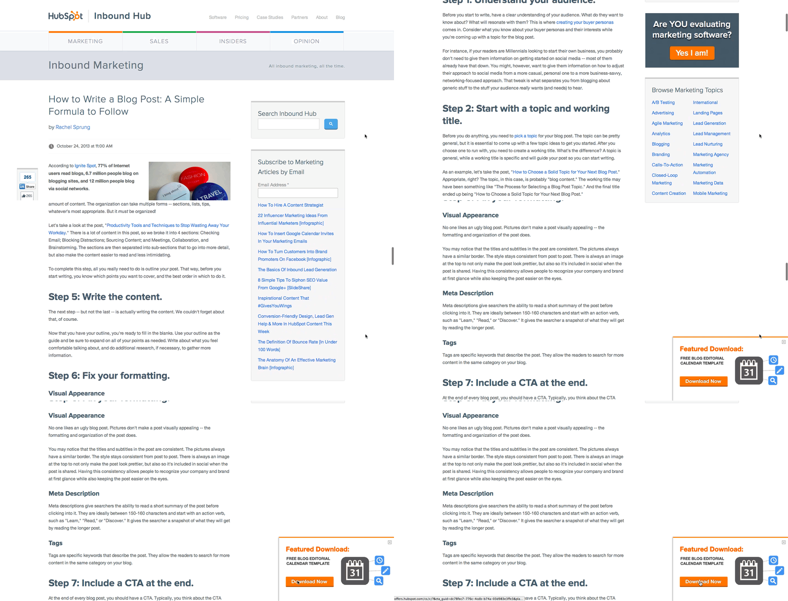
Use contrasting colors from your site. Keep it simple -- and try a tool like Canva to create images easily, quickly, and for free. Read this blog post for ideas for types of CTAs you can test on your blog., like the sliding CTA you see here:
b) The Landing Pages
According to a HubSpot survey, companies with 30+ landing pages on their website generated 7X more leads than companies with 1 to 5 landing pages.
For inspiration, here are 15 examples of well-designed landing pages you can learn from.
c) The Thank-You Pages
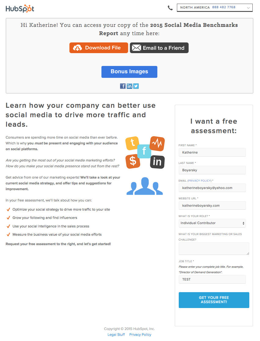
Oftentimes, it's the landing pages that get all the love in the lead generation process. But the thank-you page, where the visitor is led to once they submit a form on the landing page and convert into a lead, shouldn't be overlooked.
Along with saying thank you, be sure to include a link for your new lead to actually download the offer on your thank-you page. You can also include social sharing buttons and even a form for another, related offer, as in the example below:
Bonus: Send a Kickback Email
Once a visitor converts into a lead and their information enters your database, you have the opportunity to send them a kickback email, i.e. a "thank-you" email.
In a study HubSpot did on engagement rates of thank you emails versus non thank you emails, kickback emails doubled the engagement rates (opens and clickthroughs) of standard marketing emails. Use kickback emails as opportunities to include super-specific calls-to-action and encourage sharing on email and social media.
3) Personalize your calls-to-action.
Dynamic content lets you cater the experience of visiting your website to each, unique web visitor. People who land on your site will see images, buttons, and product options that are specifically tailored to their interests, the pages they've viewed, or items they've purchased before.
Better yet, personalized calls-to-action convert 42% more visitors than basic calls-to-action. In other words, dynamic content and on-page personalization helps you generate more leads.
How does it work? Here's an example of what your homepage may look like to a stranger:
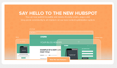
And here's what it would look like to a customer:
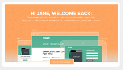
(To get dynamic content (or "smart content") on your site, you'll need to use a tool like HubSpot's Content Optimization System.)
4) Test, test, test.
We can't stress this part of the process enough. A/B testing can do wonders for your clickthrough rates.
For example, when friendbuy tried a simple A/B test on their calls-to-action, they found a 211% improvement in clickthroughs on those calls-to-action. Something as simple as testing out the wording of your CTA, the layout of your landing page, or the images you're using can have a huge impact, like the one friendbuy saw. (This free ebook has fantastic tips for getting started with A/B testing.)
5) Nurture your leads.
Remember: No lead is going to magically turn into a customer. Leads are only as good as your nurturing efforts.
Place leads into a workflow once they fill out a form on your landing page so they don't forget about you, and deliver them valuable content that matches their interest. Lead nurturing should start with relevant follow up emails that include great content. As you nurture them, learn as much as you can about them -- and then tailor all future sends accordingly.
Here's an example of a lead nurturing email:
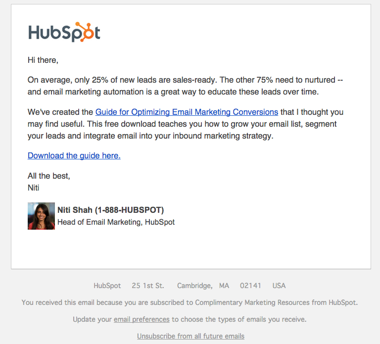
This email offers the recipient some great content, guides them down the funnel, and gets to the point. According to Forrester Research, companies that nurture their leads see 50% more sales ready leads than their non-nurturing counterparts at a 33% lower cost. So get emailing!
What other tips do you have for optimizing your website for lead generation? Share them with us in the comments.


0 Comments:
Post a Comment
Subscribe to Post Comments [Atom]
<< Home